
Sticks
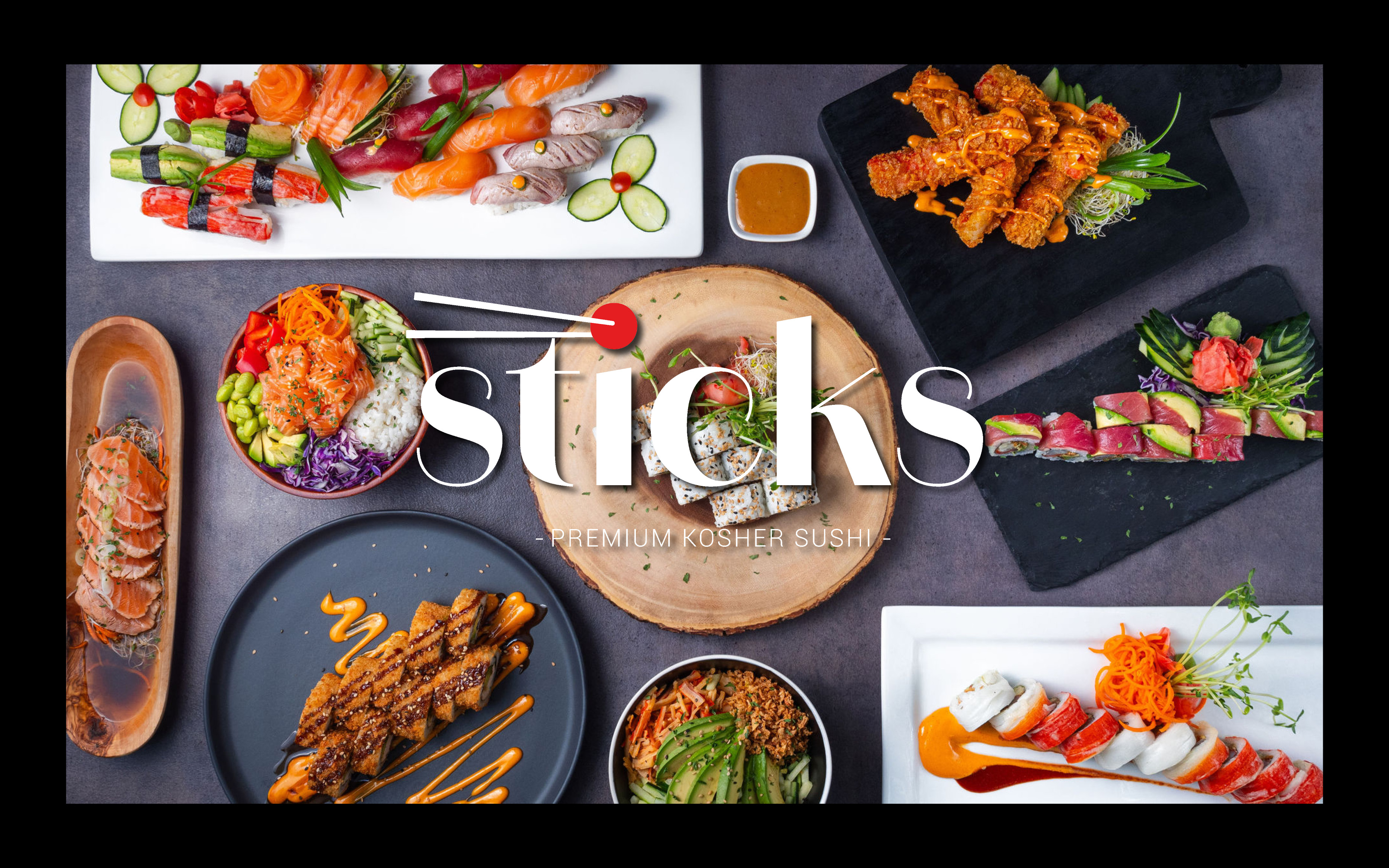
Sticks wanted to be seen as high-quality, prime, and ready to expand beyond a single location.
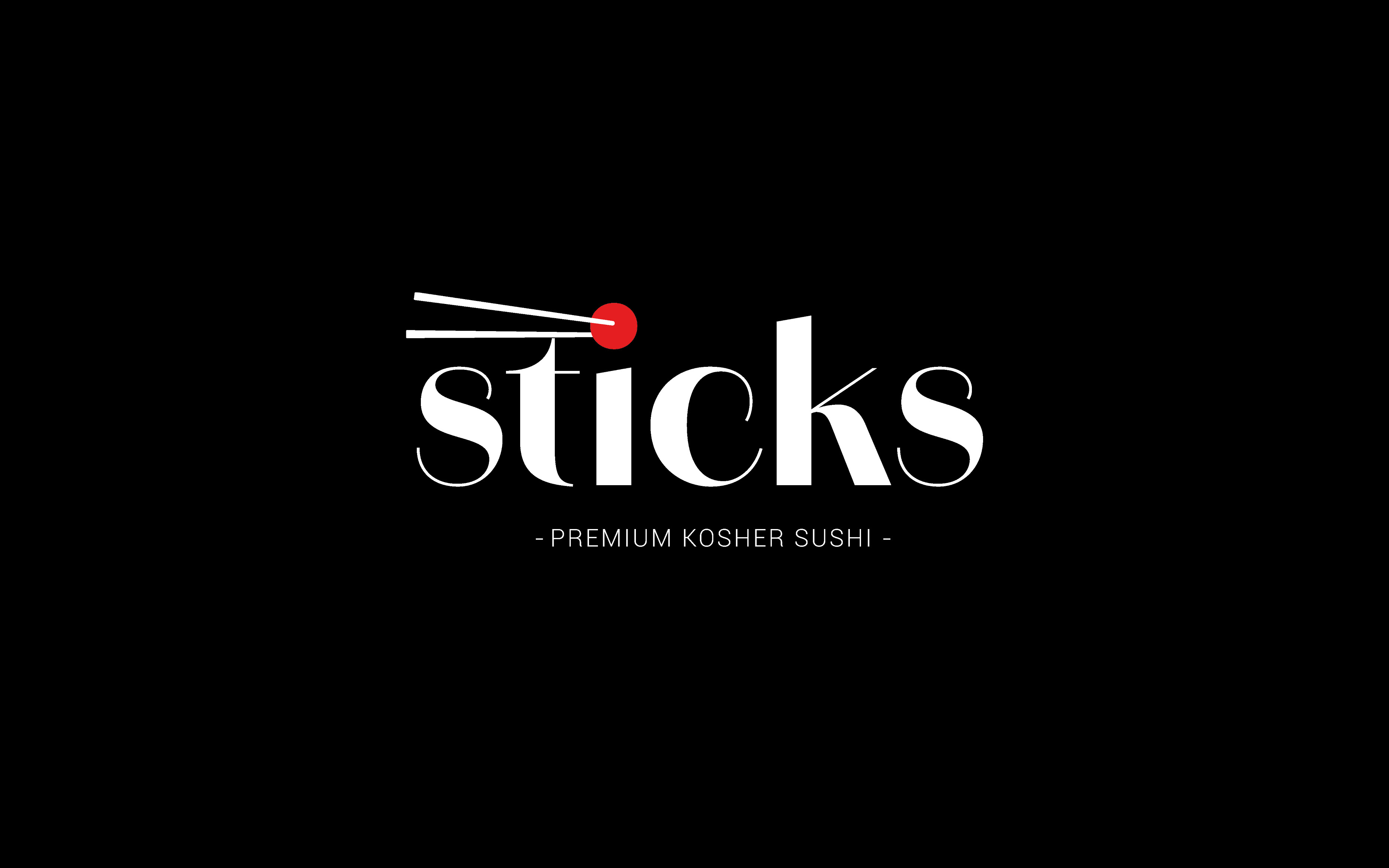
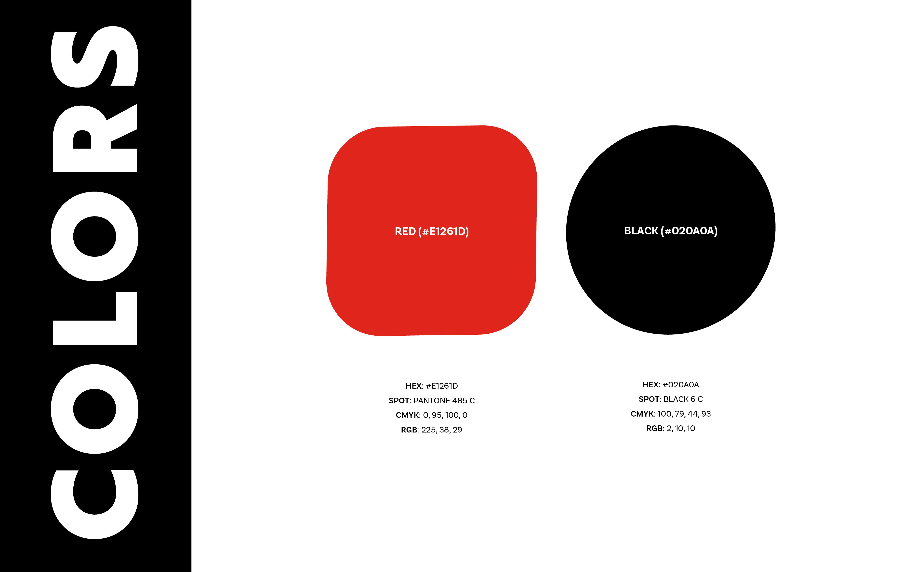
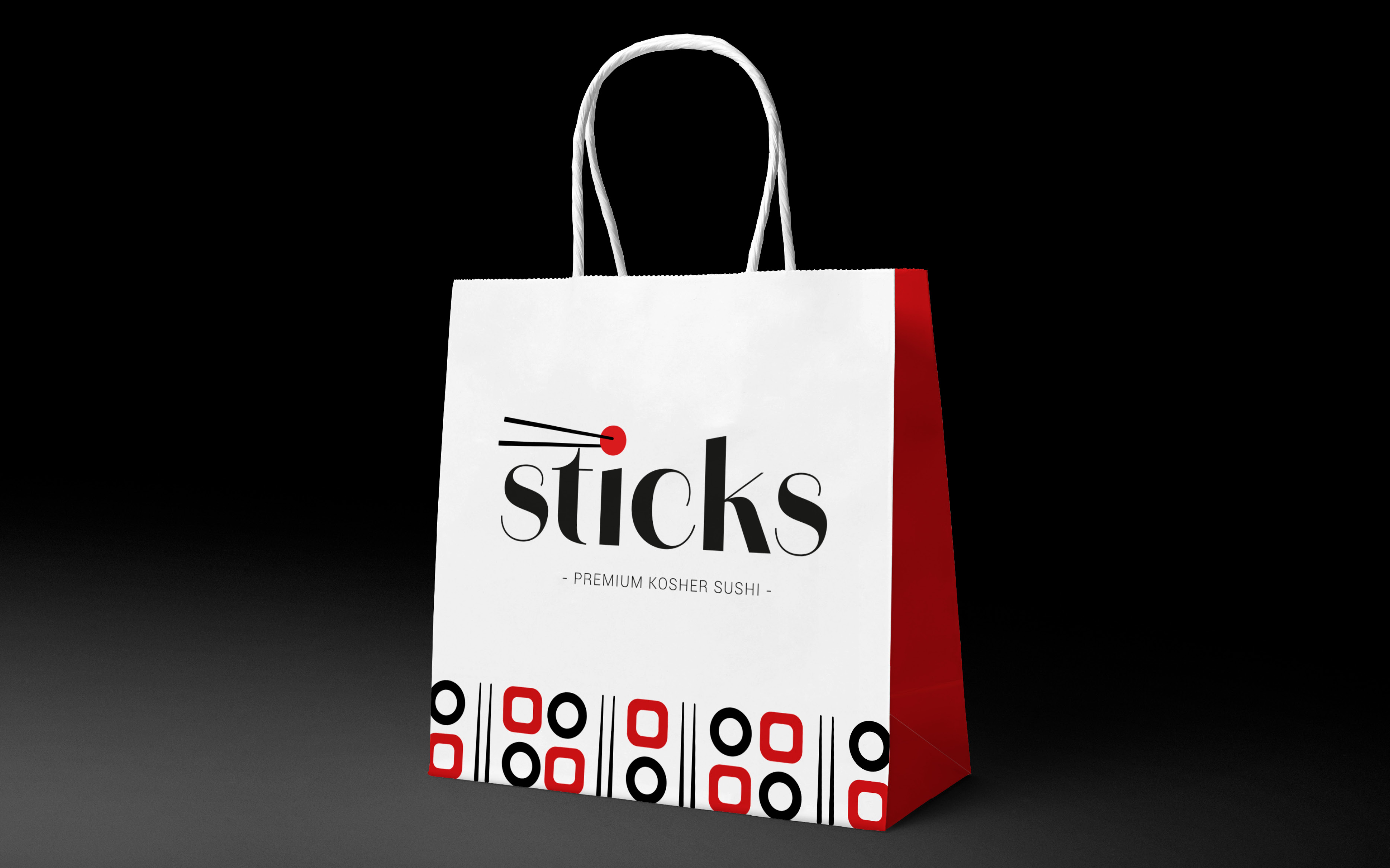
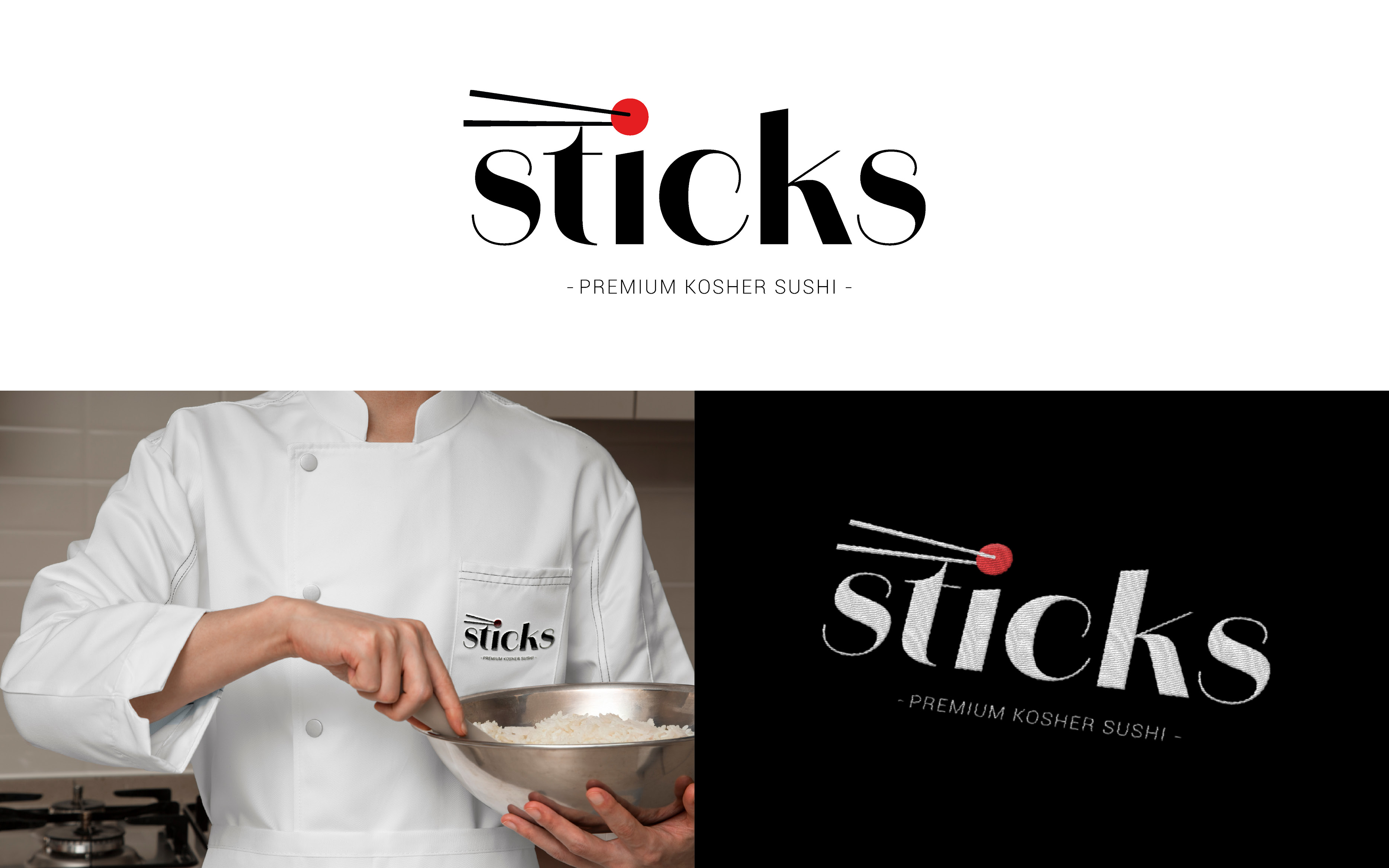
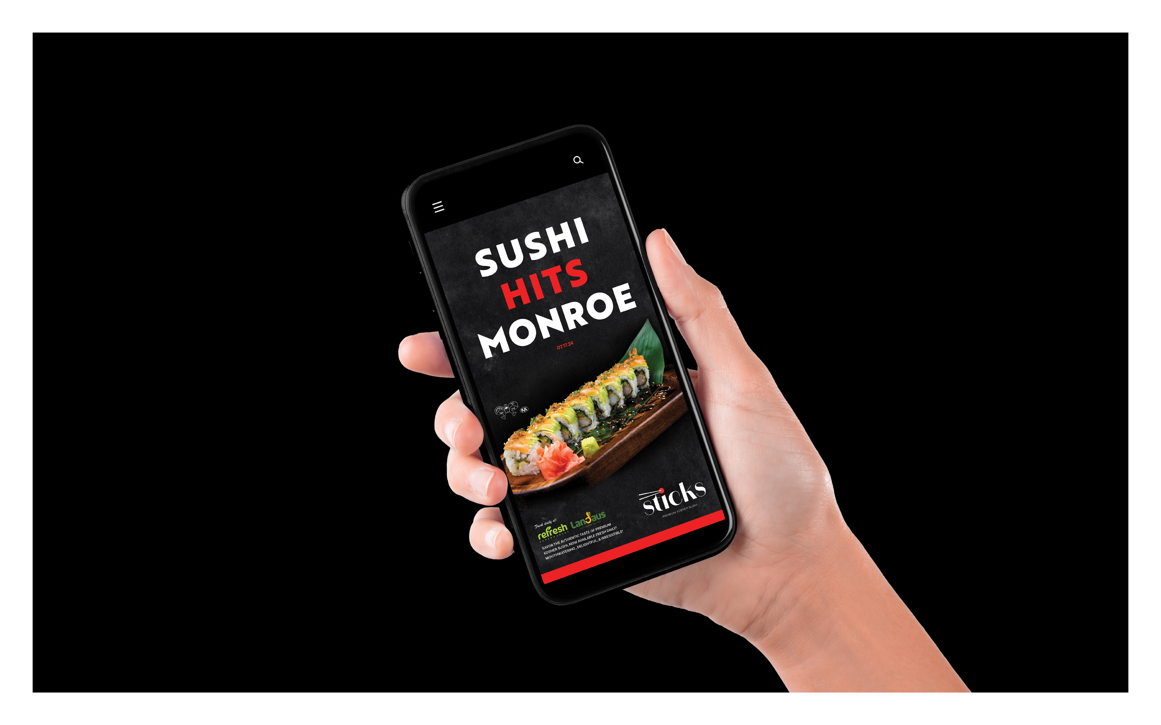
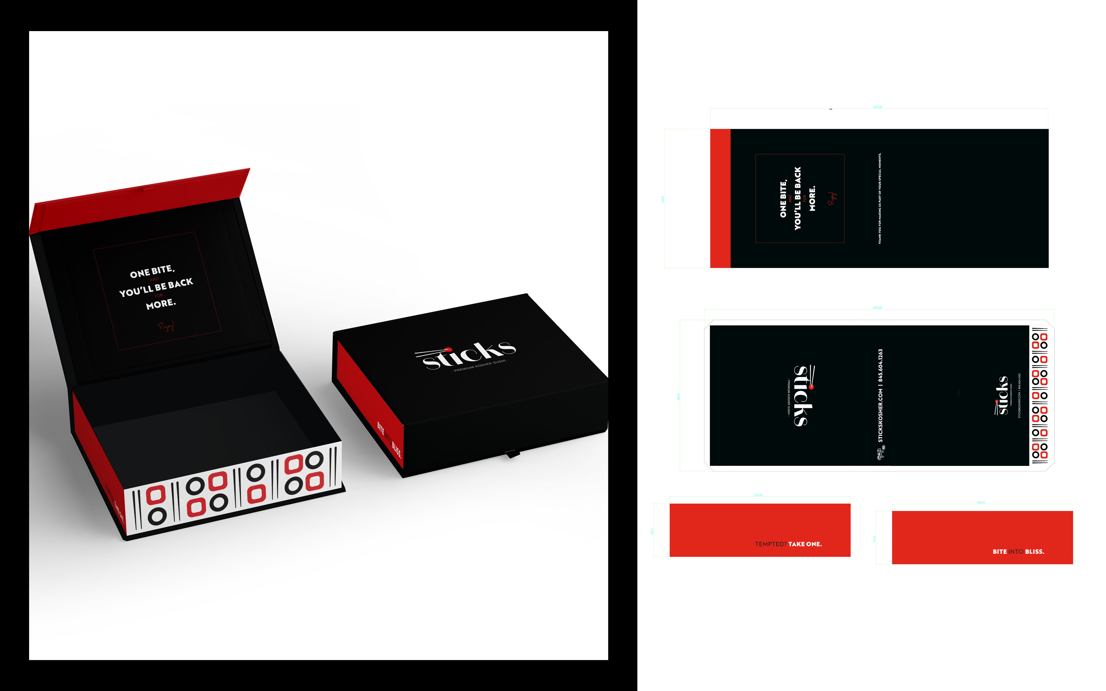
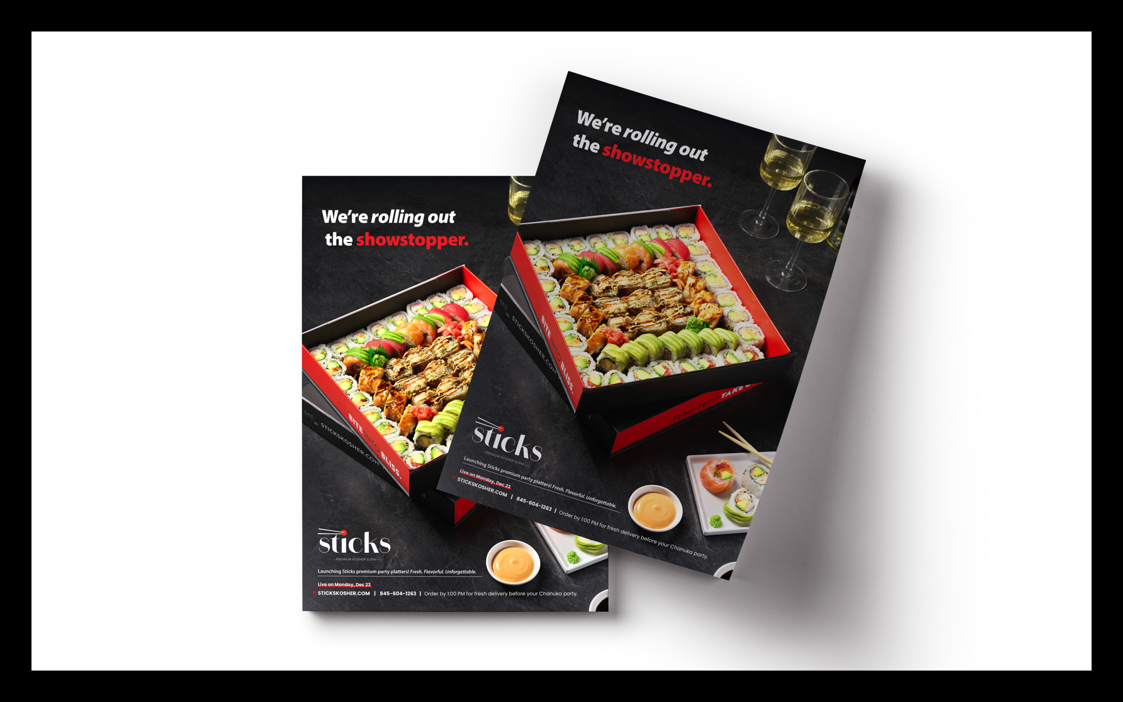
The identity was built around strong contrast — deep black for sophistication, crisp white for clarity, and a sharp red accent that signals freshness and confidence.
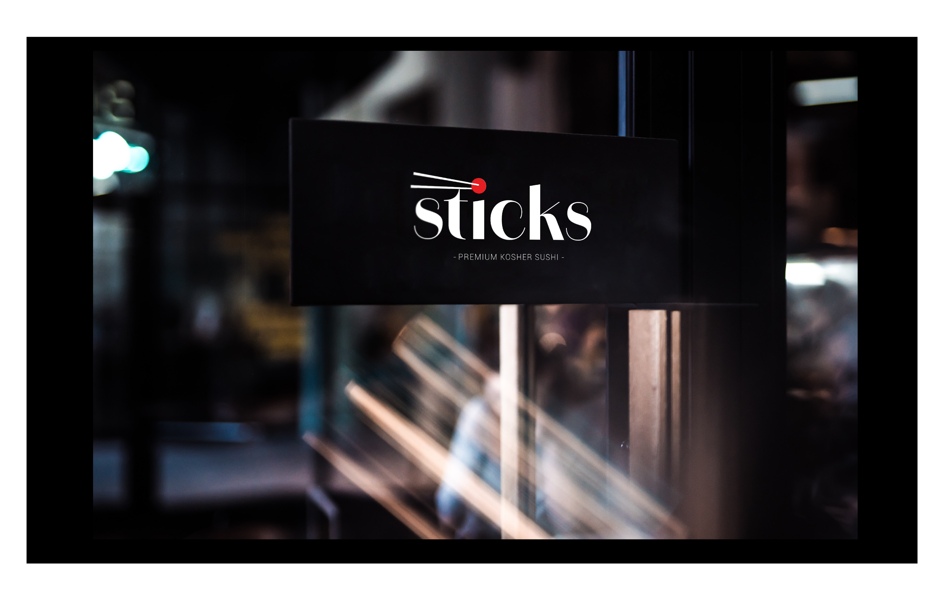
The refined serif logo, paired with the minimalist chopstick mark and red dot, gives the brand a premium, modern presence without feeling busy or trendy.
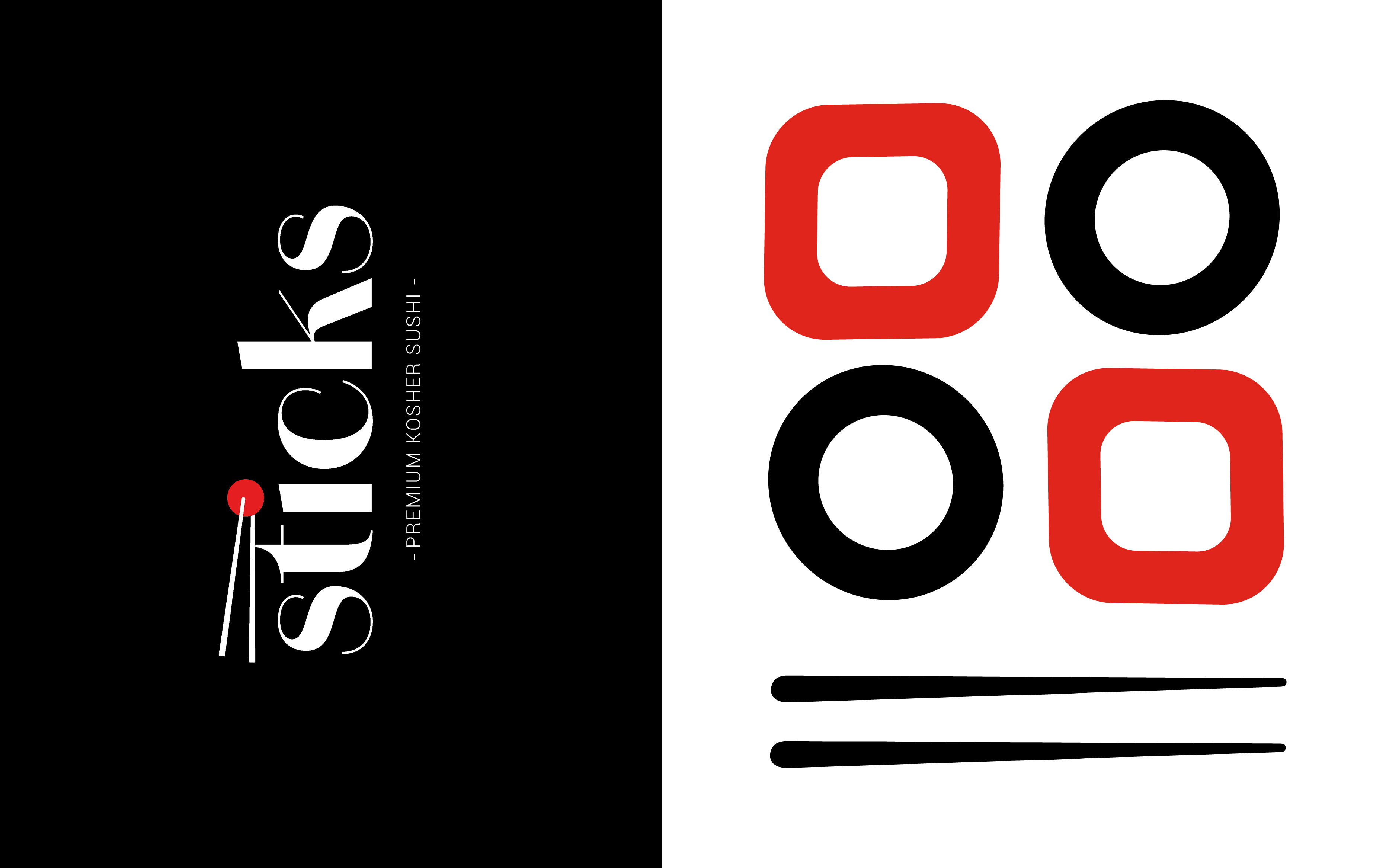
A custom geometric pattern adds structure and scalability, working seamlessly across boxes, bags, signage, uniforms, and digital.
The result is a bold, cohesive system that feels established, elevated, and ready to grow.


Launching Sticks with Beluxe Studio gave us instant positioning. We were starting from scratch, but the branding made us look established from day one. It feels prime, sharp, and built with intention.